
A shopfront is a comparatively small piece of architecture with an unusually demanding public role. It has to belong to a larger building, communicate identity at several distances and form a convincing transition between public circulation and a carefully controlled interior.
That threshold may face a city pavement, an enclosed shopping centre or an exposed retail park. Each condition changes the architectural problem. A street frontage must negotiate existing masonry, neighbouring businesses, weather and reflections. A shopfront within a shopping centre works within a more regulated visual field. A freestanding retail elevation may need to establish presence across a car park before its materials can be appreciated at close range.
The photographs have to describe those differences without allowing brand graphics to become the entire subject. Signage is important, but the architecture is carried by proportion, depth, material junctions, lighting and the way the entrance prepares the transition into the room beyond.
The shopfront within the city
On Regent Street, the shopfront occupies only the lower part of a much larger historic elevation. The building’s order is established by stonework, repeated windows, balconies and the strong horizontal division between upper floors and retail frontage. The entrance has to be distinct enough to be found while remaining subordinate to that wider composition.
A frontal photograph is useful here because it preserves the symmetry of the facade and shows the shopfront at its true scale. Pavement, neighbouring windows and the upper storeys remain in view, allowing the retail intervention to be read as part of the building rather than as a self-contained graphic panel.
Elsewhere, inherited fabric produces a closer and more irregular relationship. Stone surrounds, timber frames and neighbouring signage alter how a new fit-out is perceived. The most persuasive solution is not always the one that appears newest; it is the one that makes its own material language legible while accepting the character already present.
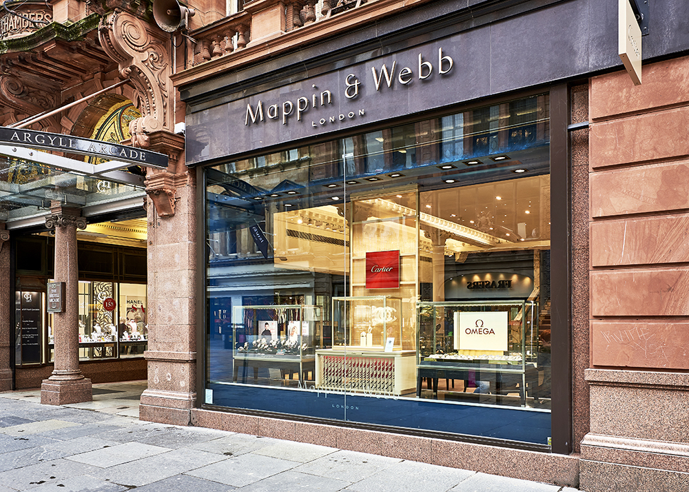

The corner condition introduces another difficulty. There is no single primary elevation: the shop is approached obliquely and the facade turns with the building. Photography needs to show that continuity while retaining enough of the surrounding street for the position of the entrance to remain clear.
A facade within a larger interior
Inside a shopping centre, the shopfront becomes an elevation within another building’s interior. Daylight, weather and traffic are replaced by polished floors, overhead lighting, neighbouring brands and continuous pedestrian movement. The threshold is still public, but the environmental conditions are highly managed.
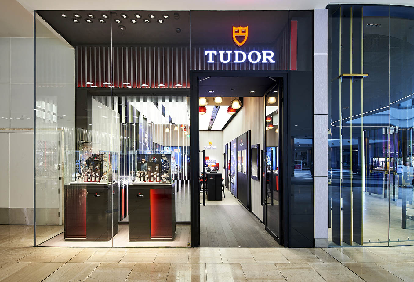
This often produces a more frontal architecture. Signage, entrance width and illuminated display bays are arranged to be read quickly from the route of circulation. The absence of a conventional pavement makes the floor finish and the line of the mall especially important: they establish where shared space ends and the retail interior begins.
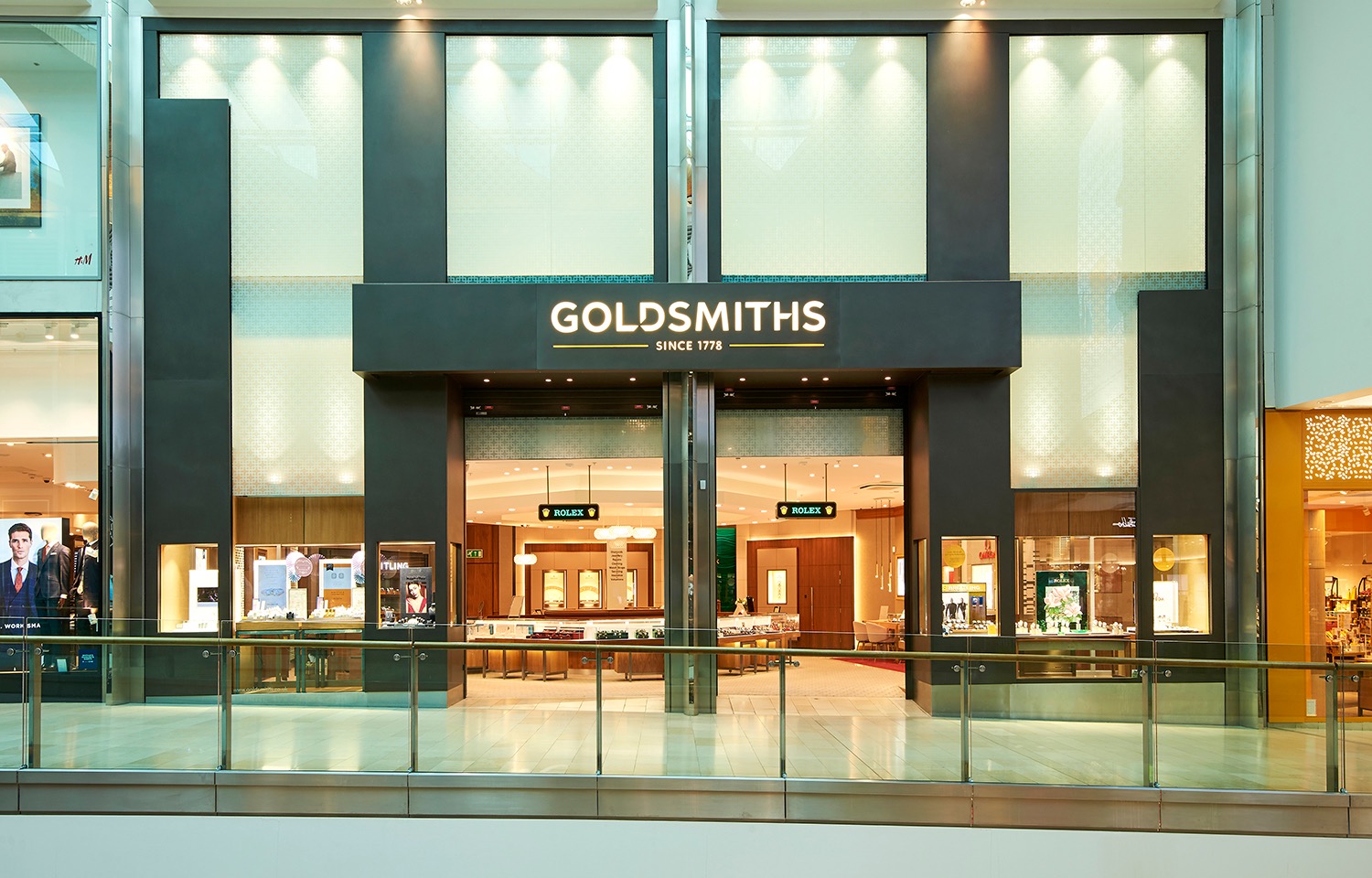
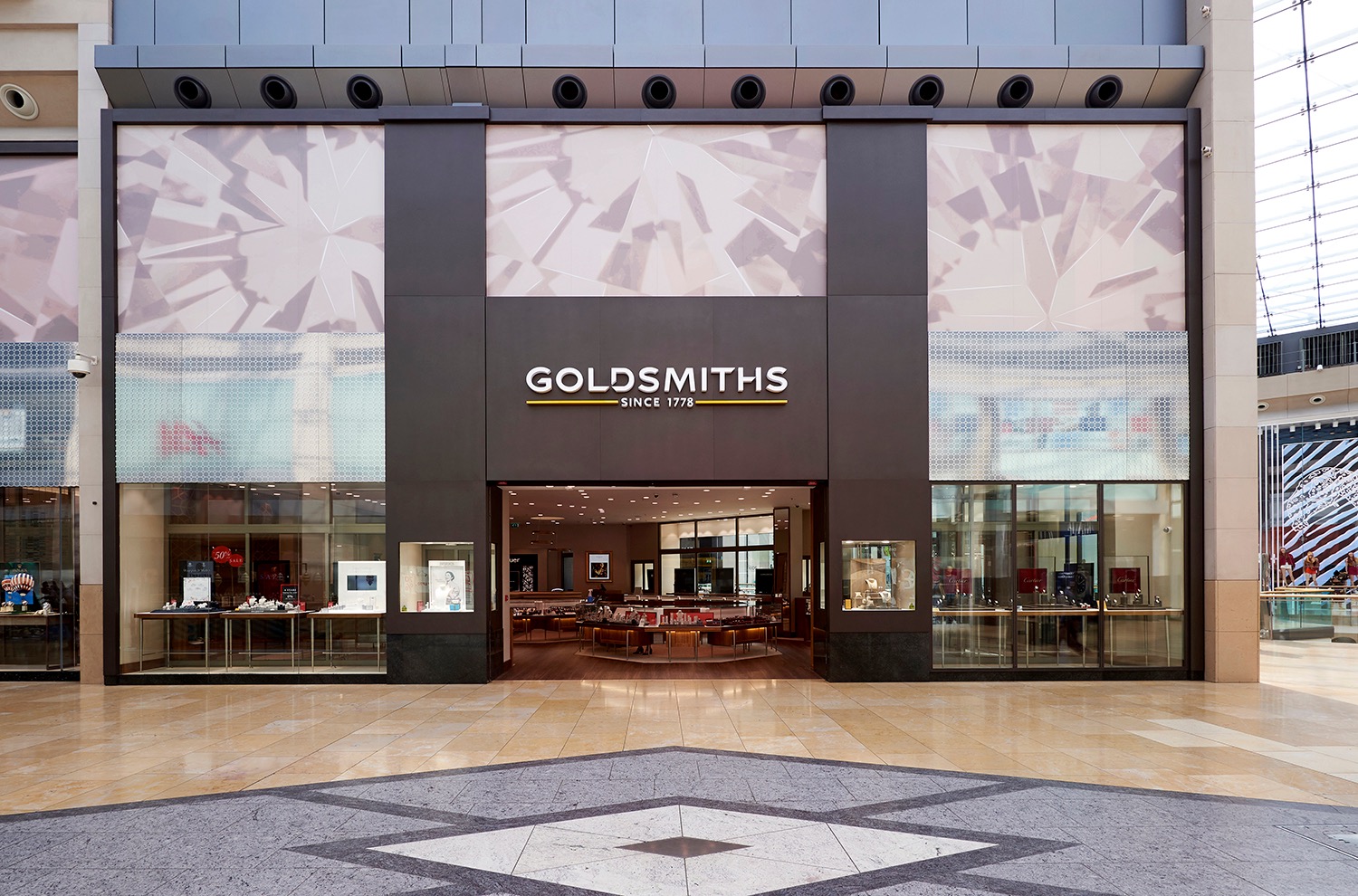
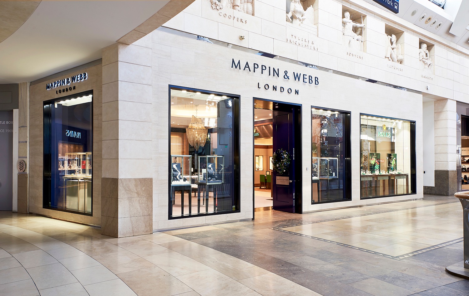
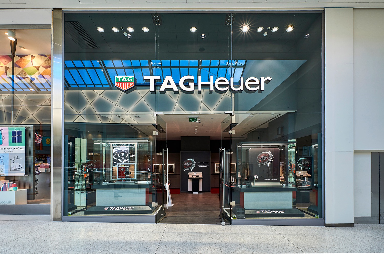
Transparency carries much of the work. An open or fully glazed entrance allows the lighting and material palette of the interior to contribute to the facade. It also makes the first internal sightline part of the architectural composition. Counters, screens and display walls cannot be considered only as furniture; from outside, they form the depth of the elevation.
Identity at building scale
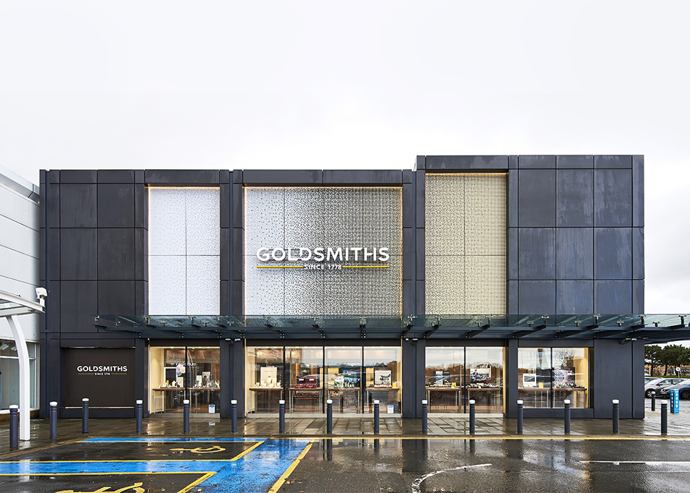
Where the store occupies a larger or more exposed elevation, identity has to work at building scale. At a retail park the shop may first be seen from a vehicle or across a broad area of hardstanding. The facade therefore depends upon large proportions and a clear overall order before any detail becomes visible.
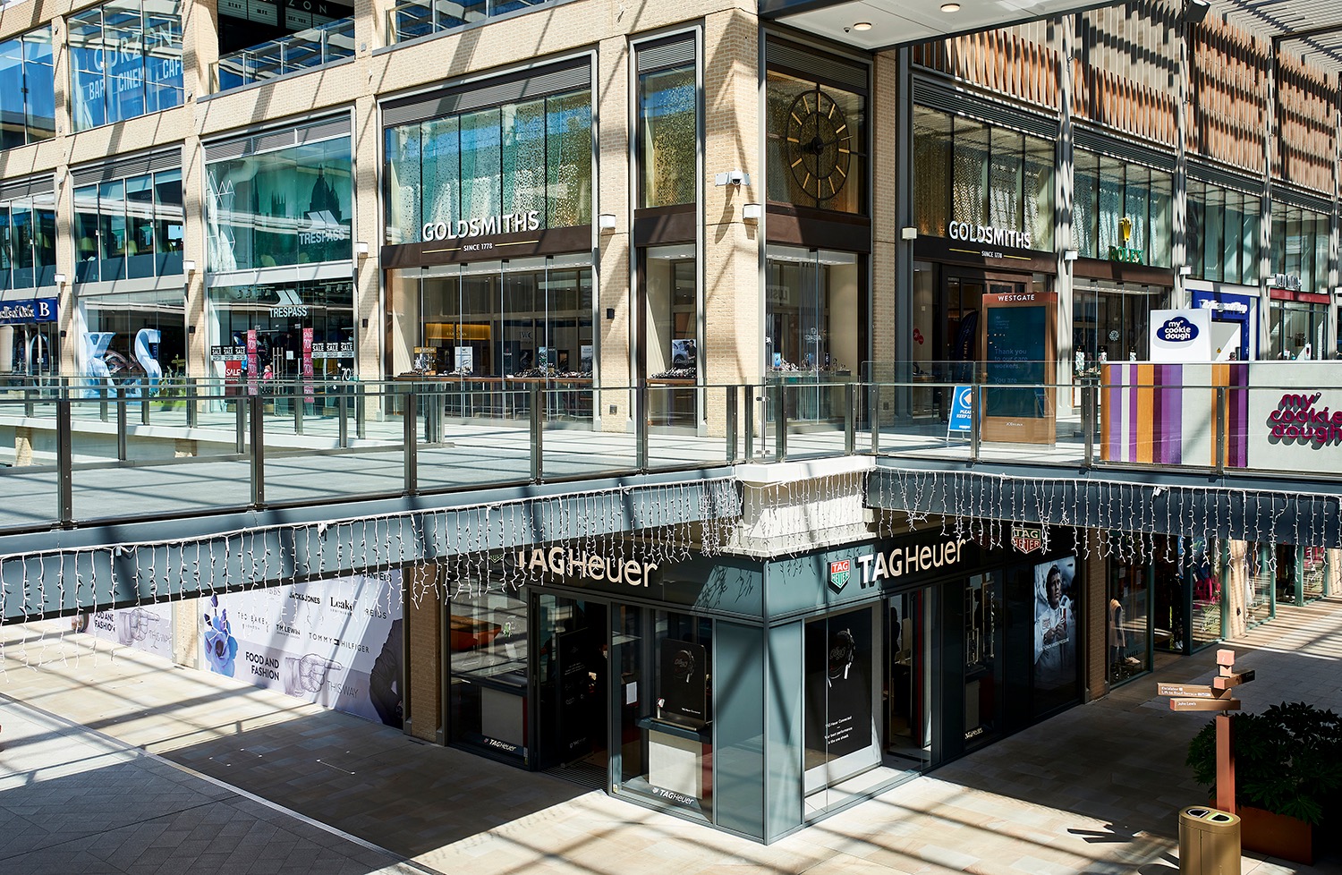
A multi-level urban frontage presents the opposite problem. It is surrounded by other glazed elevations, signs, reflections and structures. Here the architecture may extend above and below the immediate entrance, using the corner or the depth of an atrium to establish presence within a much larger commercial setting.
Material, depth and recognition
Luxury retail architecture depends heavily upon material consistency. Metalwork, stone, timber, glass, lighting and signage have to meet with the precision of the objects being displayed. The closer the viewpoint, the more visible those junctions become.
The Rolex frontages use a recognisable palette, but the architecture changes with each site. One is formed as a deep timber-framed portal, another as a more symmetrical entrance, while a third uses a patterned screen to extend the facade beyond the windows. The repeated identity is adapted through proportion and construction rather than simply applied as a sign.
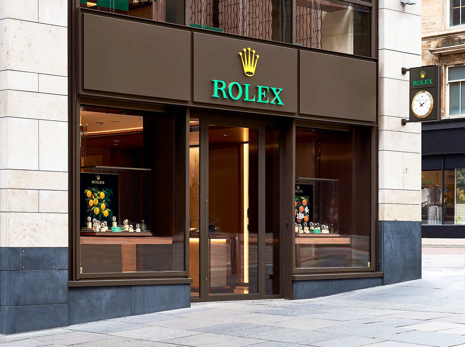
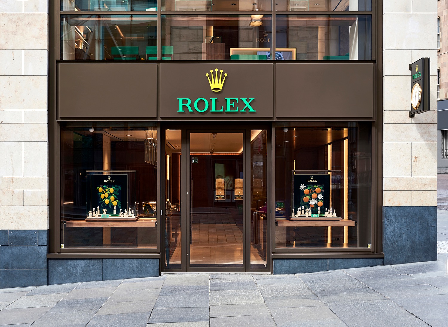
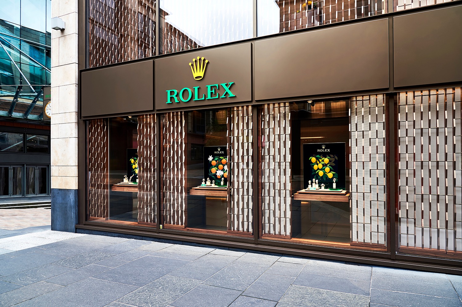
Glass complicates this material reading because it belongs simultaneously to the shop and to its surroundings. Reflections carry neighbouring buildings, sky and passing movement across the facade while the illuminated interior remains visible behind them. Removing every reflection would make the architecture appear detached from its setting; leaving them uncontrolled can obscure the work. The judgement lies in retaining context without losing clarity.
Crossing into the room
The threshold does not end at the door. Once inside, the first sequence of spaces has to slow the visitor’s movement and establish a different atmosphere from the street or shopping centre. Light levels become more controlled, materials are encountered at close range and circulation is directed by display cases, walls and changes in ceiling or floor finish.
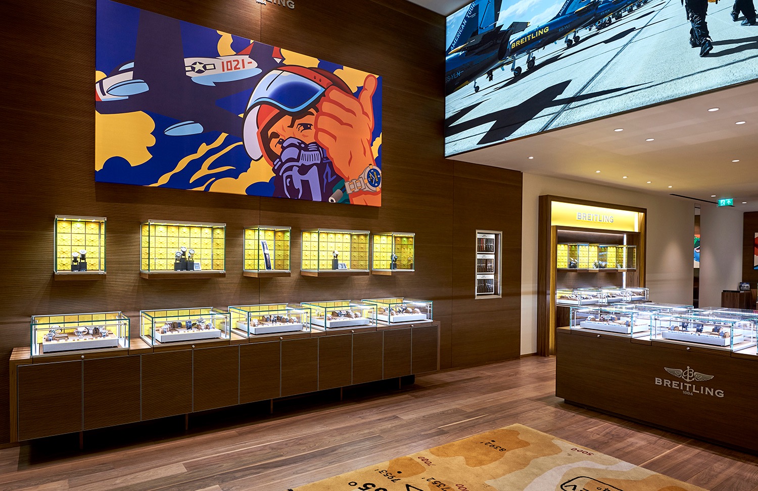
Photography should preserve that sequence. A view towards a display wall may also need to show the stair, the edge of an adjoining room or daylight returning through the shopfront. These relationships explain how the fit-out is organised and prevent the photographs from becoming isolated records of surfaces and furniture.
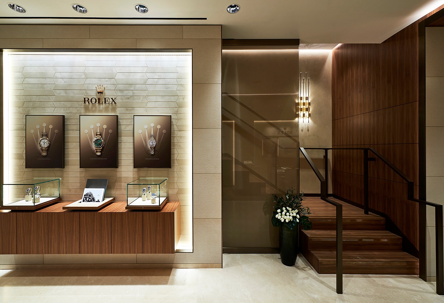
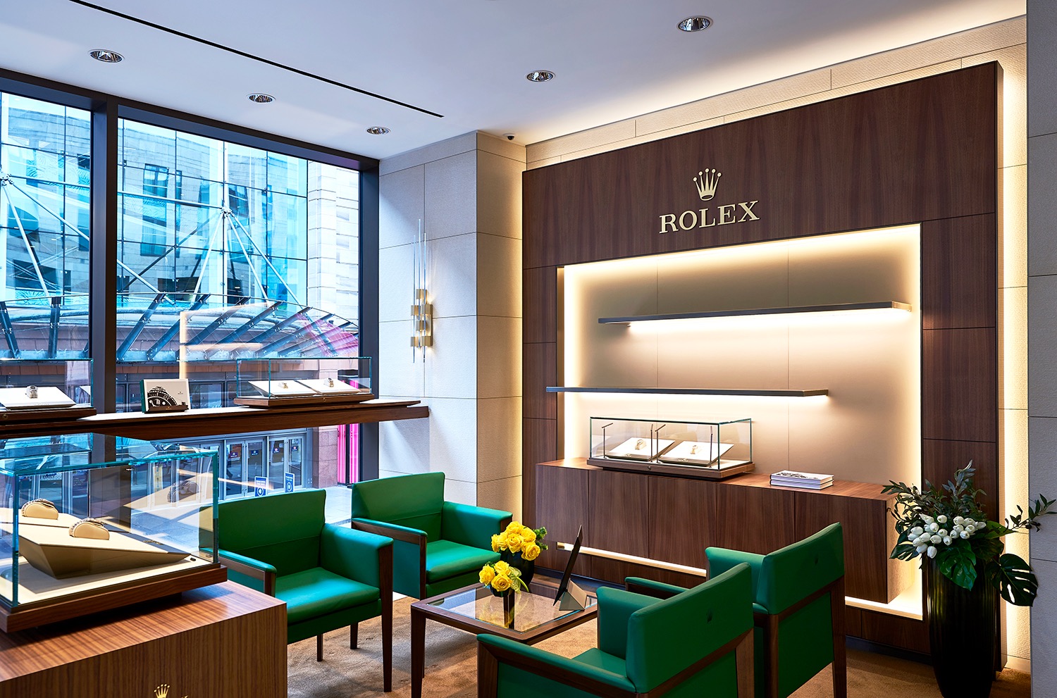
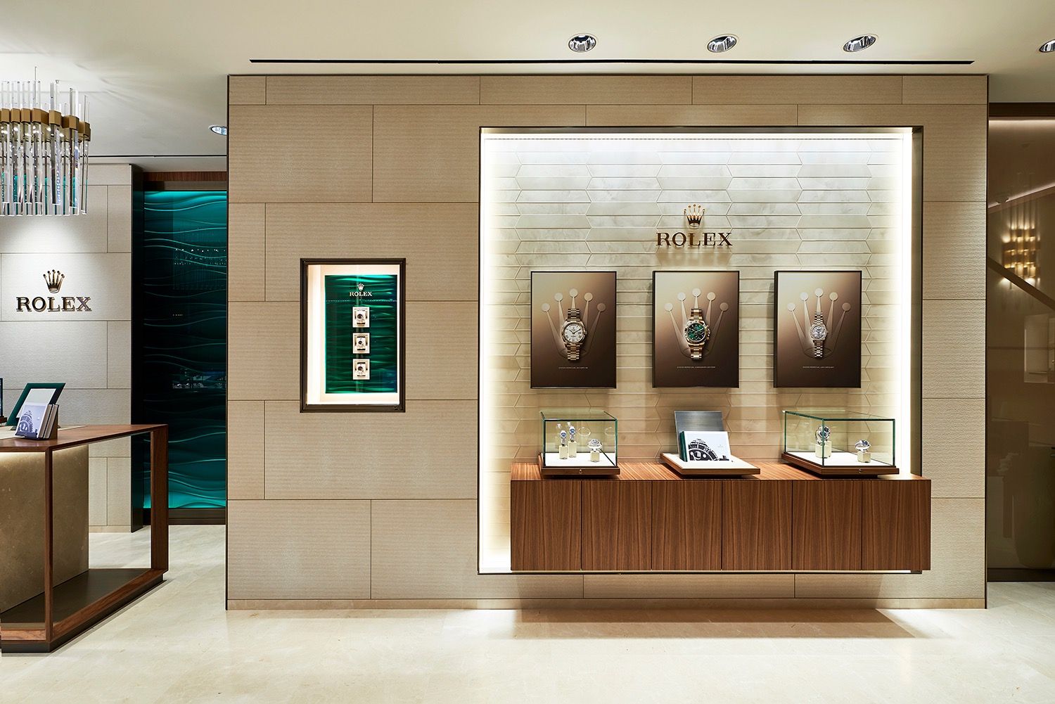
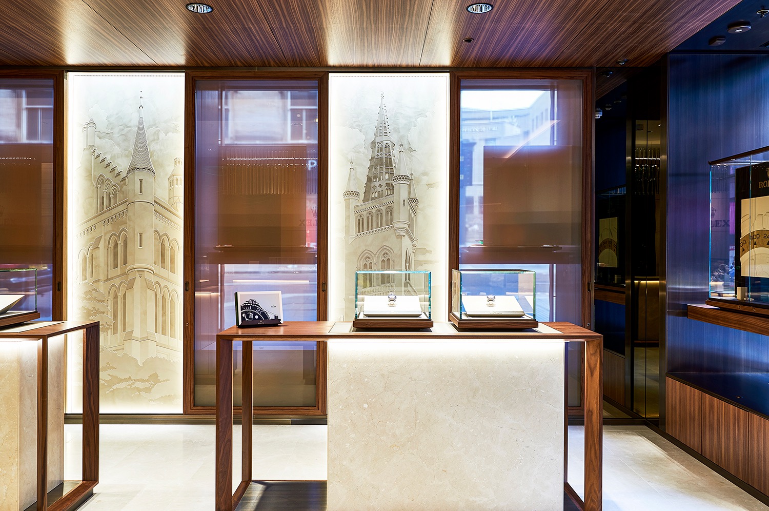
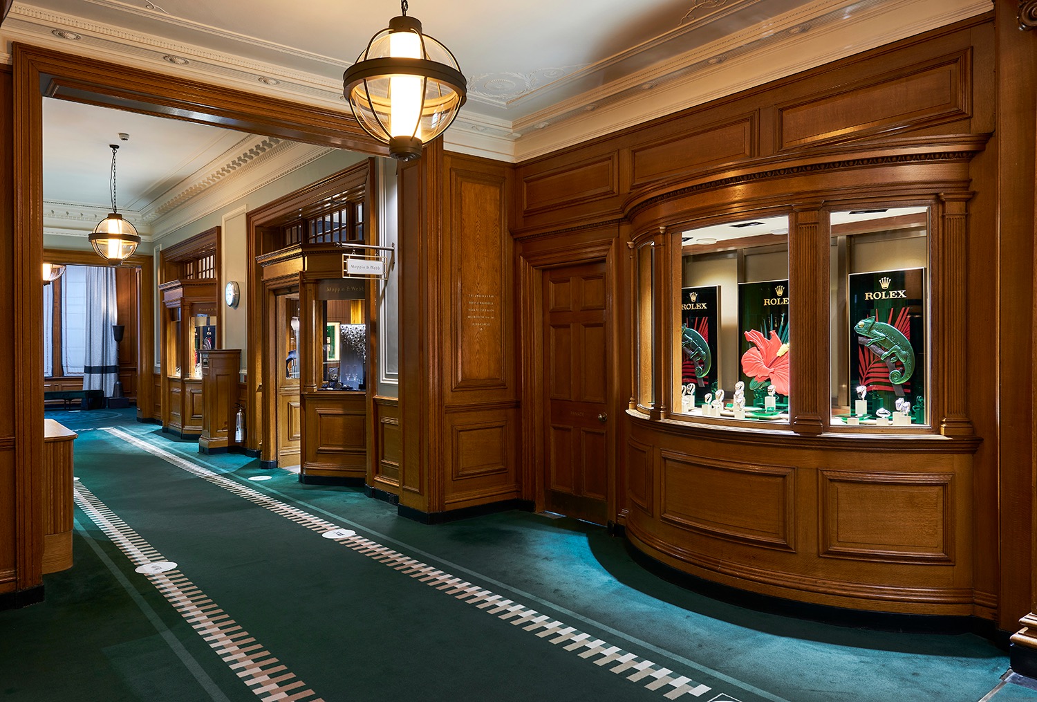
Not every interior begins from a neutral shell. At Gleneagles, dark timber panelling, framed openings and a strongly patterned floor create a deliberately domestic sequence. The retail displays are absorbed into an established architectural language rather than arranged as freestanding objects.
A record of the complete threshold
A useful set of retail photographs has to move between several responsibilities. It records the shopfront as part of a building, explains how the entrance is approached, shows the material resolution of the facade and follows the transition into the principal interior spaces.
No one view can do all of this. The direct elevation provides order; the oblique view reveals depth; the wider context explains where the store belongs; and the interior sequence shows what the threshold prepares the visitor to enter.
Together, the photographs describe retail architecture as more than branding applied to a frontage. They show the threshold as a constructed relationship between public space and commercial interior—one in which identity is carried by architecture, material and movement as much as by the name above the door.